Monday, 15 February 2016

Organic Research

Yellow

The word 'yellow' is defined as being "the colour of egg yolks or ripe lemons...cowardly...become slightly yellow with age." (1) This shows that the word has a wide range of meanings depending on the context used, though it is mostly used to describe the visual properties of an object.
          Yellow is seen as a colour that represents warmth, as it is linked with the sun's light. As such it adapts the underlying emotional effects of being in the sunlight; when a person sees yellow, they may emotionally connect it to happiness. The sun affects your mood dramatically by giving off Vitamin D, and for many people that have enough exposure to it, there is an increase in levels of happiness. (2) This representation is applicable across many forms of media. Within the art world, yellow is one of the three primary colours that can be mixed with each other to create all remaining colours - making it one of the most important tools in creative expression. As with all elements of art, yellow has a much deeper assortment of meanings than simply warmth and positivity. While lighter tints of yellow can represent things that are bright, new and joyful, darker shades are more commonly associated with envy, sickness and decay. (3) 
File:Vincent Willem van Gogh 128.jpg          One example of such artwork that incorporates lighter yellow tints is Van Gogh's painting of sunflowers (right). (4) As can be seen in this famous painting, bright tints are used for the fresh, blossoming sunflowers. There is an overall atmosphere of joy and peace in this artwork, which ironically does not mirror the condition of Van Gogh at the time of its creation. He grew increasingly unstable over his adult years, in what some would call his 'descent into madness,' before he committed suicide. During this breakthrough period, Van Gogh experienced a bout of intense activity - painting seventy canvas pieces in just as many days. (5) This simply shows that you cannot judge the creator's personality on the nature of what they have created. 


 --------------------------------------------------

In researching the word 'yellow,' I first used a dictionary to find its definition, in order to get a solid description of what the word represents. Then I went onto the Internet to explore the representations of yellow as a colour, including a scientific explanation of the link between the colour and the warmth of sunlight. Next, I found it appropriate to research yellow's importance in the art world, including how variants of the colour have a larger array of artistic meanings than once thought. Afterwards, I continued to use online resources to find an example of artwork that would justify one of the aforementioned representations of selected variations of the colour yellow. I felt that the natural conclusion to this research would be to further divulge into the life of the artist behind this example, using information found online.

--------------------------------------------------

(1) Hawker, S. (2006) Colour Oxford English Dictionary. Oxford, England: Oxford University Press.

(2) The Huffington Post, (2016). Simple Lifestyle Change Linked To Improved Moods. [online] Available at: http://www.huffingtonpost.com/2013/10/06/sunshine-happiness-behavior-mood_n_4014477.html [Accessed 15 Feb. 2016].

(3) Finearttips.com, (2010). The Color ‘Yellow’: The Hidden Meaning for Your Art & Design - The Art and Fine Art Tips with Lori McNee. [online] Available at: http://www.finearttips.com/2010/07/the-color-yellow-the-hidden-meaning-for-your-art-design/ [Accessed 15 Feb. 2016].

(4) Van Gogh, V. (1888). Still Life: Vase with 12 sunflowers. [oil on canvas] Munich: Neue Pinakothek.

(5) Thorpe, V. (2000). Van Gogh letters shed new light on his 'madness'. [online] the Guardian. Available at: http://www.theguardian.com/uk/2000/dec/10/vanessathorpe.theobserver [Accessed 15 Feb. 2016].


Tuesday, 2 February 2016

Anthropomorphism Illustration Experiment

TITLE

Using non-human characters to enhance the narrative elements of a text.

INTENT

To instil fear and caution by using anthropomorphism.

EXAMPLE

Paula Rego - Nursery Rhyme Etchings.

ANALYSIS


Paula Rego uses subtle signs and clues in her Nursery Rhyme etchings that are effective in conveying a message of fear to the viewer. These include her use of monochromatic colours, and how she balances her use of black and white in each image. Also, she manages to portray a sense of loneliness through these images, which emphasises the fact that these nursery rhymes are often based on individuals.


EXPERIMENT/CONTENT

I looked at a poem by the name of "The Spangled Pandemonium" by Palmer Brown. Then, I created a visual response to this poem, which included an anthropomorphic character that has a sense of fear and horror. By using the traits I found in Paula Rego's work, I was able to create an image in her style, using my interpretation of the content presented within the aforementioned poem.


EVALUATE

My response to the poem shows elements of monochromatic colours, a good balance of black and white, and a sense of loneliness. The vastness of the landscape portrays this sense well, with the figures in the centre of the image also silhouetted against the pitch-blackness of the night. Another effective part of the image is the shape of the anthropomorphic creature that hides in the tree, as the viewer's eyes snake up the park trail before reaching the appendages of the Spangled Pandemonium. The hatched pen marks of the leaves and trail gives an element of the etching style favoured by Paula Rego, which works well when used to indicate the strength and direction of light from the moon.


------------------------------------------------------------------------------------------------


(1) Rego, P. (1989). Little Miss Muffet (III). [Etching and aquatint] Casa Das Historias - Paula Rego.

Friday, 15 January 2016

Encoding + Signs

For the first task of the new theory module, we had to complete several experiments related to encoding and signs. In this task, we focused on line, colour, composition, and setting a scene; then we applied our knowledge of these aspects to a famous piece of art. Afterwards, we researched the artistic stylings of a particular film director - adapting the aforementioned artwork to better fit the recognised characteristics of said director's style.


Line


In the first series of experiments, I drew eight of the given expressive lines in my interpretation. While the 'Gentle', 'Honest' and 'Warm' lines were soft and smooth, the more striking 'Savage' and 'Hostile' lines have a threatening look to them. My 'Unstable' line reinforced the fact that the behaviour is unbalance, but still remains on a line. On the opposite hand, 'Whimsical' is both bold and light with circular shapes throughout its unpredictable figure. The 'Anxious' line clearly shows worry and stress, with a bold line. I feel that this experiment was useful to me, in that it helped me to create my own vision of different expressions through the use of line.


Colour

In the second set of experiments, I created four abstract colour compositions from the given situations. The first is 'A calm morning' and combines blocks of blue, yellow and green into a Mark Rothko style composition. The light colours signify the freshness of the day. For the second composition - 'The ice cold sea', I combined shades of blue with the negative space of the page to give a chilling icy feel. The composition is presented in a fish-eye lense to further solidify the aquatic locale. 'A long day' is a horizontal amalgamation of the first composition's design, with colours to signify the passage of time throughout a day, The subtle directional arrow leads the viewer's eye from morning to sunset. The final composition, 'A loud conversation,' is one of the more minimalist compositions that draws on the previous line experiment to convey the volume and tone of a two-way conversation.The dark colours suggest the conversation is of an aggressive nature. This experiment was also useful as it allowed me to use colour liberally and portray my ideas in the most abstract manner possible.


Composition

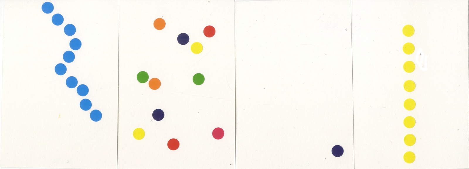
In the third set of experiments, I created four small compositions using stickers. From left to right, they represent 'flowing,''chaotic,''lonely,' and 'static.' As the first and last compositions convey opposing expressions, I decided to portray them as the colour of water and electricity, respectively. 'Chaotic' is full of bright, unorganised colours while 'lonely' has only one sticker in the corner. Producing these sorts of compositions was easier than the other experiments, as we were given a set shape, colours and amount of stickers to work with, though this limited how expressive each composition could be.


Setting a scene

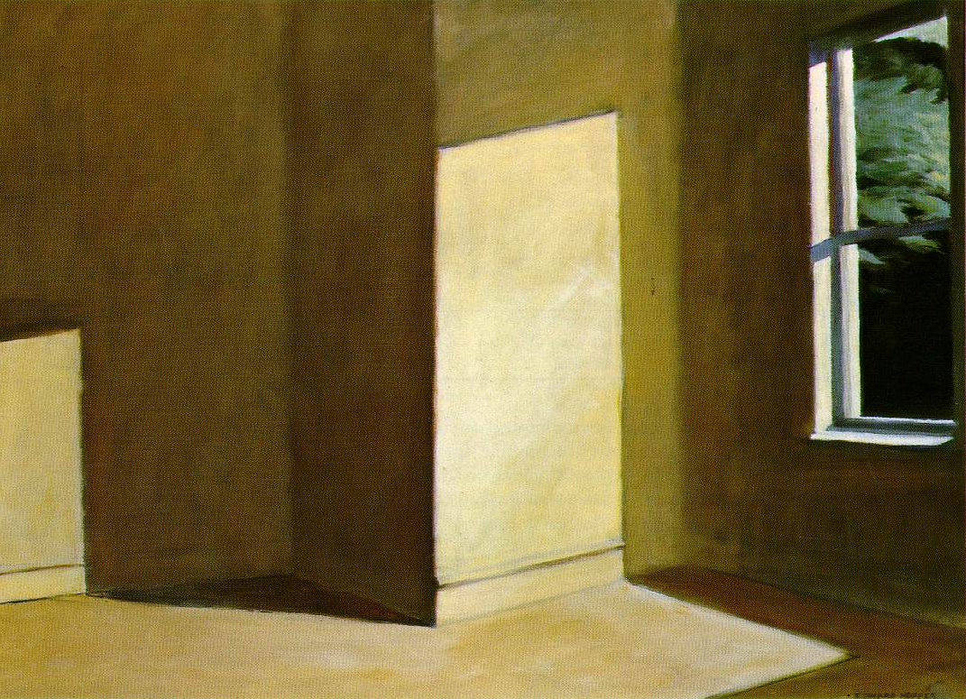
For the next task, we had to choose from one of few Edward Hopper paintings, and alter it to reflect a different artistic mood. I chose 'Sun in an Empty Room,' which can be seen on the left. I pursued the opposite effect of the painting, creating a 'twilight' version of the painting. This was created by using coloured pencil over an image of the original - resulting in a surprisingly effective night scene. My version uses various shades of blue and can be seen on the left below.


On the Wings of Nighthawks

(2)

In a group, we were then tasked with analysing the visual content of the above painting, 'Nighthawks.' To us, the painting looked cosy, calm and welcoming, featuring a favourite place (while retaining aspects of loneliness) at twilight in an American city. Afterwards, I looked at a mise-en-scene from a particular director (the arrangement of scenery and stage properties in a production) and researched their visual language. The director I chose to research was Stanley Kubrick. This allowed me to make thumbnails of the painting, with the influence of Kubrick's identity and associated traits within his movies. As can be seen below, I have created a series of thumbnails with visible aspects of the traits in each.

(Left to right: Extreme camera angle, extreme wide-angle lense, strong visual identity, extreme coldness, one-point perspective/symmetry, extreme close-up)
The above thumbnails were created using pencil, pen and coloured pencils. In producing them, I tried to convey each of the director's traits as well as I could. Many of Stanley Kubrick's movie characteristics lend themselves well to Edward Hopper's Nighthawks. In particular, his unique ability to provide his films with an atmosphere of extreme coldness, works in direct contrast to the painting's warm and welcoming feel.

Throughout these exercises, I have learned the importance of both recognising and portraying expression and character through line, colour and composition. By comparing physical artwork to modern cinema, I realised how connective the two artistic mediums can be, and that the qualities of encoding and signs apply to both in equal importance.


----------------------------------------------------------------------------------------------------------------------------------------------

(1) Hopper. E. (1963). Sun in an Empty Room. [Oil on canvas] Private collection.
(2) Hopper, E. (1942). Nighthawks. [Oil on canvas] Chicago, Illinois: Art Institue of Chicago.


Monday, 7 December 2015

Political Cartoon report

Political cartoons have portrayed the actions and traits of politicians for many years, serving as parodies to some of the most notable events in political history. These cartoonists strive to visually show the truth behind the country's figureheads and can put any unsuspecting politician in the spotlight.


Political Anthropomorphism

For the first report, I made a perfectly innocuous illustration of David Cameron giving a speech in front of 10 Downing Street, but gave him a pig's head instead. This refers to the scandal of him allegedly "having relations" with a pig, but also shows the stereotype of the Prime Minister being greedy in terms of the economy. (1)


Exaggerated Features

For the second report, I made a coloured illustration of Ed Miliband, looking distraught. In this image, I exaggerated his nose and lower half of his face, to emphasise the size of his nose and the looseness of his cheeks. I decided to make his face red with embarrassment and his suit is ruffled, maybe after coming back from a disastrous speech. I gave him a "Vote Bacon" badge as a reference to Miliband's idolization of David Cameron. (2)


Cartoon Strip

For the third report, I made a black-and-white political cartoon strip, referencing the recent involvement of ISIS terrorists with European attacks. Ironically, the fear-mongerers are scared off by the dirty nature of London's politicians - the "Rats". At the end, DaPig Cameron makes an appearance, which serves to show that maybe he shouldn't bad-mouth other politicians when he himself has his own political shortcomings. (3) (4)


Visual Metaphor

For the final report, I created a muti-layered graphic illustration, parodying the famous Obama "Hope" poster. In my version, "Pope," I used the likeness of Pope Francis to mirror the promises of himself and Barack Obama, during their initial year(s) as Pope and President, respectively. I managed to invoke the same thematic expression of the original work by using the same colours and style. (5) (6)


--------------------------------------------------------------------------------------------------------------------------

(1) (David Cameron / 10 Downing Street reference image from The Telegraphhttp://www.telegraph.co.uk/news/general-election-2015/11563550/David-Cameron-My-plan-for-the-Tories-first-100-days-in-power.html - Accessed 5/12/2015)

(2) (Ed Miliband reference image from The Spectatorhttp://new.spectator.co.uk/2015/04/how-ed-miliband-lost-the-jewish-vote/ - Accessed 6/12/2015)

(3) (Houses of Parliament reference image from e-architecthttp://www.e-architect.co.uk/london/houses-parliament - Accessed 5/12/2015)

(4) (House of Commons reference image from The Telegraphhttp://www.telegraph.co.uk/news/politics/11307612/How-weve-brought-the-House-of-Commons-into-the-21st-century.html - Accessed 5/12/2015)

(5) (Pope Francis reference image from Biographyhttp://www.biography.com/people/pope-francis-21152349 - Accessed 7/12/2015)

(6) (Barack Obama reference image from Esquire - http://www.esquire.com/news-politics/interviews/a35288/shepard-fairey-street-art-obama-hope-poster/ - Accessed 7/12/2015. Original poster design by Shepard Fairey.)

Concept Art report

Concept art can be produced through a variety of styles and mediums, to achieve a broad array of results. For many of my own reports into this field, I constructed a scene to compliment three of the visual styles I chose to explore.


Environmental Concept

For the first report, I produced a rather minimalist environment, depicting the scene that I would use for my other reports. I played around with adding mist coming down from the mountains to the Dead Forest. The monochromatic landscape not only serves the rough, sketchy style, but creates an element of mystery and decay.


Storyboard

For the second report, I made an eight-panel storyboard, depicting a scene where a Hero is ambushed when walking throught the Dead Forest. I intentionally used little colour and action cues as that is what would be used in an early storyboard concept. With these limitations however, I still managed to present the sense of increasing darkness as the Giant Spiders grew closer to the protagonist.


Frottage

For the third report, I digitally painted a frottage version of one of the Giant Spiders in the aforementioned scene. By rubbing over various utensils, I was able to import some defined textures into a Photo Editing Program. From there I applied the textures into the shape of the arachnid. The net rubbing in the background proved to be a good representation of a spider's web, while other dark textures helped to create the spider's furry body and legs.


Biomechanical Concept

For the final report, I went a different route and engaged in another interest of mine from the field of Concept Art. The above illustration is a biomechanical pen drawing of a self-sufficient insect-machine hybrid. This huge creature is covered in metal and oozes excess liquids from its maw. The level of detail I put into this illustration only serves to make the subject all the more real and intimidating.


--------------------------------------------------------------------------------------------------------------------------

Sara Fanelli report

Sara Fanelli's work leans towards the more absurd spectrum of illustration, demonstrated by her use of unrefined and surreal elements that have strong links to Dadaism. The philosophical questions she posed in many of her earlier artworks still hold true to this day.


Eyes

For the first report, I constructed an image that incorporated Sara Fanelli's signature use of eyes in her works. A basic background and figure works well alongside the detailed photographs within the head. As well as this, the simplicity of the character is juxtaposed by the complex emotions shown through their eyes. (1)


Digital Collage

For the second report, I made an illustration based off of one of my own profound questions. Inside the shell of the man are all the elements that I perceive to make up a man, which are their own separate illustrations. Some of these are more abstract, for instance, the arrow represents a clear sense of direction, while the storm-cloud shows that a man needs to understand and express his emotions.


Existential Illustration

For the third report, I created a simple text-based illustration, posing an existential question to the viewer. The square borders represent conformity and a sense of being trapped, and are coloured with monotonous grey and white. I have added a traditional prison ball-and-chain, which takes the shape of a question mark at one end, as if leading on from the above text.


Traditional Collage

For the final report, I made a paper collage using various snippets and images from a regulated woman's magazine. The collage was made to demonstrate the rubbish and unwanted gossip that is published in these types of magazines on a consistent basis. It is in a tree shape to show how much of a waste of paper celebrity magazines are. (2)


--------------------------------------------------------------------------------------------------------------------------

(1) (Photographs of eyes taken from Google Image Search - "Black and white eyes")
(2) (Text articles and celebrity images taken from New! Magazine)

Editorial Illustration report

Editorial Illustration develops drawings to be incorporated in newspaper/magazine articles, advice columns, etc, and often represent the themes portrayed within the text. Examples of the methodologies found in this type of illustration are presented below. 
Interpretive Illustration - Social Commentary

For the first report, I created an illustration that reflects the interpretative sub-tones of certain accompanying texts. This image mirrors how people can feel trapped by society, and that your place in the world is always changing. It shows that, while we may have control of where we are, we cannot escape routine.


Article Illustration

For the second report, I created a small illustration to go alongside an article. The aim of the image was to visually describe what is in the article. This image represents how a person who gives advice, but does not take it themselves, ultimately has more problems than the person they are trying to help.


Using lightness and humour

For the third report, I drew an illustration of a dragon-like creature wearing a business suit. This portrays the scary and often unpredictable world of Business through a visual medium. The box on the creature's head is used to show that not all parts of Business are entirely factual, and that people need to be aware of made-up statistics and money-making methods.


Conceptualising the abstract

For the final report, I chose to conceptualise the abstract subject of the Underworld. While many modern interpretations have similar ideas on the visual design of the Underworld, this design remained somewhat simple, with a staircase leading underground to an endless pit of flames. The lighting in this illustration is successful, as I have shown a contrast between the foreground and background - strengthening the illusion of depth.


--------------------------------------------------------------------------------------------------------------------------