Line

Colour
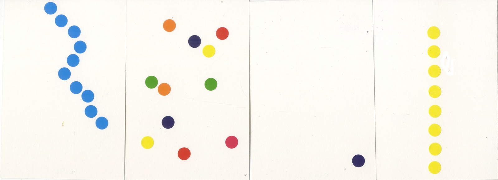
In the second set of experiments, I created four abstract colour compositions from the given situations. The first is 'A calm morning' and combines blocks of blue, yellow and green into a Mark Rothko style composition. The light colours signify the freshness of the day. For the second composition - 'The ice cold sea', I combined shades of blue with the negative space of the page to give a chilling icy feel. The composition is presented in a fish-eye lense to further solidify the aquatic locale. 'A long day' is a horizontal amalgamation of the first composition's design, with colours to signify the passage of time throughout a day, The subtle directional arrow leads the viewer's eye from morning to sunset. The final composition, 'A loud conversation,' is one of the more minimalist compositions that draws on the previous line experiment to convey the volume and tone of a two-way conversation.The dark colours suggest the conversation is of an aggressive nature. This experiment was also useful as it allowed me to use colour liberally and portray my ideas in the most abstract manner possible.
Composition
 For the next task, we had to choose from one of few Edward Hopper paintings, and alter it to reflect a different artistic mood. I chose 'Sun in an Empty Room,' which can be seen on the left. I pursued the opposite effect of the painting, creating a 'twilight' version of the painting. This was created by using coloured pencil over an image of the original - resulting in a surprisingly effective night scene. My version uses various shades of blue and can be seen on the left below.
On the Wings of Nighthawks
 (2)
(2)In a group, we were then tasked with analysing the visual content of the above painting, 'Nighthawks.' To us, the painting looked cosy, calm and welcoming, featuring a favourite place (while retaining aspects of loneliness) at twilight in an American city. Afterwards, I looked at a mise-en-scene from a particular director (the arrangement of scenery and stage properties in a production) and researched their visual language. The director I chose to research was Stanley Kubrick. This allowed me to make thumbnails of the painting, with the influence of Kubrick's identity and associated traits within his movies. As can be seen below, I have created a series of thumbnails with visible aspects of the traits in each.
 |
| (Left to right: Extreme camera angle, extreme wide-angle lense, strong visual identity, extreme coldness, one-point perspective/symmetry, extreme close-up) |
Throughout these exercises, I have learned the importance of both recognising and portraying expression and character through line, colour and composition. By comparing physical artwork to modern cinema, I realised how connective the two artistic mediums can be, and that the qualities of encoding and signs apply to both in equal importance.
----------------------------------------------------------------------------------------------------------------------------------------------
(1) Hopper. E. (1963). Sun in an Empty Room. [Oil on canvas] Private collection.
(2) Hopper, E. (1942). Nighthawks. [Oil on canvas] Chicago, Illinois: Art Institue of Chicago.
No comments:
Post a Comment