Monday 7 December 2015

Political Cartoon report

Political cartoons have portrayed the actions and traits of politicians for many years, serving as parodies to some of the most notable events in political history. These cartoonists strive to visually show the truth behind the country's figureheads and can put any unsuspecting politician in the spotlight.


Political Anthropomorphism

For the first report, I made a perfectly innocuous illustration of David Cameron giving a speech in front of 10 Downing Street, but gave him a pig's head instead. This refers to the scandal of him allegedly "having relations" with a pig, but also shows the stereotype of the Prime Minister being greedy in terms of the economy. (1)


Exaggerated Features

For the second report, I made a coloured illustration of Ed Miliband, looking distraught. In this image, I exaggerated his nose and lower half of his face, to emphasise the size of his nose and the looseness of his cheeks. I decided to make his face red with embarrassment and his suit is ruffled, maybe after coming back from a disastrous speech. I gave him a "Vote Bacon" badge as a reference to Miliband's idolization of David Cameron. (2)


Cartoon Strip

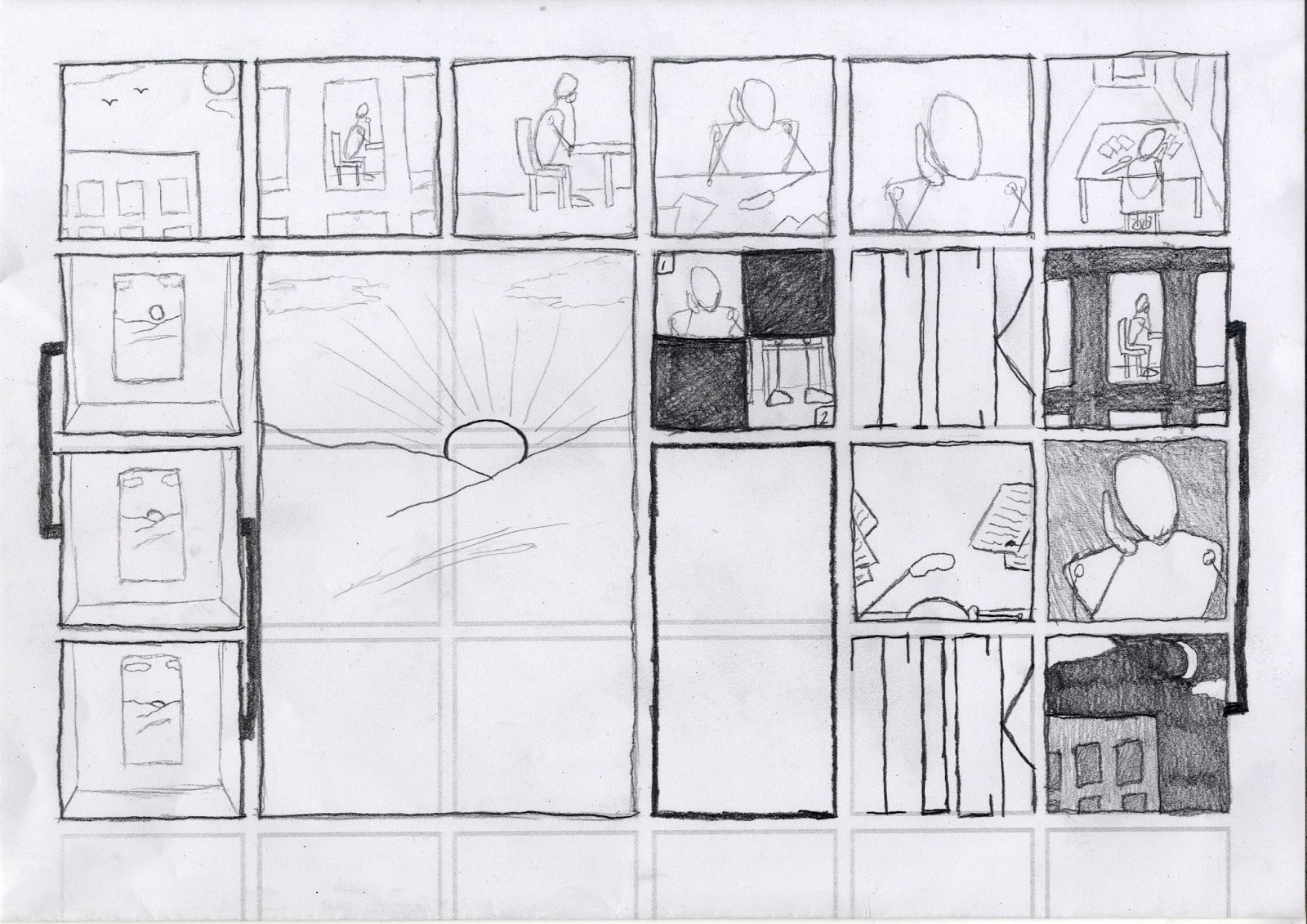
For the third report, I made a black-and-white political cartoon strip, referencing the recent involvement of ISIS terrorists with European attacks. Ironically, the fear-mongerers are scared off by the dirty nature of London's politicians - the "Rats". At the end, DaPig Cameron makes an appearance, which serves to show that maybe he shouldn't bad-mouth other politicians when he himself has his own political shortcomings. (3) (4)


Visual Metaphor

For the final report, I created a muti-layered graphic illustration, parodying the famous Obama "Hope" poster. In my version, "Pope," I used the likeness of Pope Francis to mirror the promises of himself and Barack Obama, during their initial year(s) as Pope and President, respectively. I managed to invoke the same thematic expression of the original work by using the same colours and style. (5) (6)


--------------------------------------------------------------------------------------------------------------------------

(1) (David Cameron / 10 Downing Street reference image from The Telegraphhttp://www.telegraph.co.uk/news/general-election-2015/11563550/David-Cameron-My-plan-for-the-Tories-first-100-days-in-power.html - Accessed 5/12/2015)

(2) (Ed Miliband reference image from The Spectatorhttp://new.spectator.co.uk/2015/04/how-ed-miliband-lost-the-jewish-vote/ - Accessed 6/12/2015)

(3) (Houses of Parliament reference image from e-architecthttp://www.e-architect.co.uk/london/houses-parliament - Accessed 5/12/2015)

(4) (House of Commons reference image from The Telegraphhttp://www.telegraph.co.uk/news/politics/11307612/How-weve-brought-the-House-of-Commons-into-the-21st-century.html - Accessed 5/12/2015)

(5) (Pope Francis reference image from Biographyhttp://www.biography.com/people/pope-francis-21152349 - Accessed 7/12/2015)

(6) (Barack Obama reference image from Esquire - http://www.esquire.com/news-politics/interviews/a35288/shepard-fairey-street-art-obama-hope-poster/ - Accessed 7/12/2015. Original poster design by Shepard Fairey.)

Concept Art report

Concept art can be produced through a variety of styles and mediums, to achieve a broad array of results. For many of my own reports into this field, I constructed a scene to compliment three of the visual styles I chose to explore.


Environmental Concept

For the first report, I produced a rather minimalist environment, depicting the scene that I would use for my other reports. I played around with adding mist coming down from the mountains to the Dead Forest. The monochromatic landscape not only serves the rough, sketchy style, but creates an element of mystery and decay.


Storyboard

For the second report, I made an eight-panel storyboard, depicting a scene where a Hero is ambushed when walking throught the Dead Forest. I intentionally used little colour and action cues as that is what would be used in an early storyboard concept. With these limitations however, I still managed to present the sense of increasing darkness as the Giant Spiders grew closer to the protagonist.


Frottage

For the third report, I digitally painted a frottage version of one of the Giant Spiders in the aforementioned scene. By rubbing over various utensils, I was able to import some defined textures into a Photo Editing Program. From there I applied the textures into the shape of the arachnid. The net rubbing in the background proved to be a good representation of a spider's web, while other dark textures helped to create the spider's furry body and legs.


Biomechanical Concept

For the final report, I went a different route and engaged in another interest of mine from the field of Concept Art. The above illustration is a biomechanical pen drawing of a self-sufficient insect-machine hybrid. This huge creature is covered in metal and oozes excess liquids from its maw. The level of detail I put into this illustration only serves to make the subject all the more real and intimidating.


--------------------------------------------------------------------------------------------------------------------------

Sara Fanelli report

Sara Fanelli's work leans towards the more absurd spectrum of illustration, demonstrated by her use of unrefined and surreal elements that have strong links to Dadaism. The philosophical questions she posed in many of her earlier artworks still hold true to this day.


Eyes

For the first report, I constructed an image that incorporated Sara Fanelli's signature use of eyes in her works. A basic background and figure works well alongside the detailed photographs within the head. As well as this, the simplicity of the character is juxtaposed by the complex emotions shown through their eyes. (1)


Digital Collage

For the second report, I made an illustration based off of one of my own profound questions. Inside the shell of the man are all the elements that I perceive to make up a man, which are their own separate illustrations. Some of these are more abstract, for instance, the arrow represents a clear sense of direction, while the storm-cloud shows that a man needs to understand and express his emotions.


Existential Illustration

For the third report, I created a simple text-based illustration, posing an existential question to the viewer. The square borders represent conformity and a sense of being trapped, and are coloured with monotonous grey and white. I have added a traditional prison ball-and-chain, which takes the shape of a question mark at one end, as if leading on from the above text.


Traditional Collage

For the final report, I made a paper collage using various snippets and images from a regulated woman's magazine. The collage was made to demonstrate the rubbish and unwanted gossip that is published in these types of magazines on a consistent basis. It is in a tree shape to show how much of a waste of paper celebrity magazines are. (2)


--------------------------------------------------------------------------------------------------------------------------

(1) (Photographs of eyes taken from Google Image Search - "Black and white eyes")
(2) (Text articles and celebrity images taken from New! Magazine)

Editorial Illustration report

Editorial Illustration develops drawings to be incorporated in newspaper/magazine articles, advice columns, etc, and often represent the themes portrayed within the text. Examples of the methodologies found in this type of illustration are presented below. 
Interpretive Illustration - Social Commentary

For the first report, I created an illustration that reflects the interpretative sub-tones of certain accompanying texts. This image mirrors how people can feel trapped by society, and that your place in the world is always changing. It shows that, while we may have control of where we are, we cannot escape routine.


Article Illustration

For the second report, I created a small illustration to go alongside an article. The aim of the image was to visually describe what is in the article. This image represents how a person who gives advice, but does not take it themselves, ultimately has more problems than the person they are trying to help.


Using lightness and humour

For the third report, I drew an illustration of a dragon-like creature wearing a business suit. This portrays the scary and often unpredictable world of Business through a visual medium. The box on the creature's head is used to show that not all parts of Business are entirely factual, and that people need to be aware of made-up statistics and money-making methods.


Conceptualising the abstract

For the final report, I chose to conceptualise the abstract subject of the Underworld. While many modern interpretations have similar ideas on the visual design of the Underworld, this design remained somewhat simple, with a staircase leading underground to an endless pit of flames. The lighting in this illustration is successful, as I have shown a contrast between the foreground and background - strengthening the illusion of depth.


--------------------------------------------------------------------------------------------------------------------------

Chris Ware report

Chris Ware's work is renowned for its uniquely non-narrative sequences. Examples of the methodologies this artist practices in his own work are presented below.

Infographic

For the first report, I created an illustration in the infographic style of some of Ware's more notable works. While this methodology makes the sequence difficult to read, it allows spacial freedom. This sequence in particular shows a person at work being bored, from dusk to dawn, or vice-versa (depending on where the reader starts).


Raccord

For the second report, I created a continuing illustration in the style of raccord. The above sequence represents the panels of a window, with varying seasons of Spring, Autumn and Winter displayed out of each panel - from the sky and mountains, down to a dense forest. It can be viewed as a single illustration, as well as individual images.


Faux Advertisement

For the third report, I created a faux advertisement for hats. This illustration incorporates the winding lines and circles representative of Ware's graphic works. Through its simplicity, the reader can quickly deviate the meaning of the image - that a person will be improved after buying a hat. This is shown by the green circle at the end of the line journey, denoting a positive outcome for the customer.


Cut-out toy

For the final report, I created a cut-out toy car that can be folded to make a 3D model. While it was difficult to envision the placement of the different sections on a 2D scale, it afforded me time to think about the proportions and dimensions of each more thoroughly. 


--------------------------------------------------------------------------------------------------------------------------